Tuesday, December 20, 2011

“Smoking Kills” Analysis


“Smoking Kills” Analysis

I felt that my idea to use skulls as the key aspect to perfectly flow with the idea that “Smoking Kills” as it is the best to show the dangers of smoking itself. My intent is to visually represent the future of constant use of smoking in a deeply depressing way. What I mean by that is to show the worst of the things that can happen to you such as death. So I took a picture of a skull of Google images and enhanced the features and added smoke to add an effect. I used three different skulls for three different posters. One was a 2D basic hazardous skull on chemical cans which I added a bright yellow and added an embossed to make it pop from the background. With a cross of cigarettes like the pirates use but not cross bones. The second one was a dark one which blended with a black background so I converted it to red with a color overlay and added optical flares into the eyes to make it extremely pop and catch your eyes, then added a cigarette to his mouth to resemble what I am conveying and then of course added more smoke which gave it a devilish look to it which helps me out by showing how its dangerous. The last one I used again was a skull but with just a plain grey with some smoke around it because I made t look like it came out of the cigarette when you blow the smoke. This caused an effect of realism towards smoking.

The reason why I chose the idea to talk about “Smoking Kills” is because a lot of people do it. My friends included. So I want to show people why you shouldn’t be doing this and many don’t know about the deadly facts about it, or they are to naïve to think about it. Within that my main quote used was “Tobacco kills about 45,000 Canadians a year. That's more than the total number of deaths from AIDS, car accidents, suicide, murder, fires and accidental poisonings combined.” Not only is it a very serious thought put forth into your mind which causes you to think about it more, but it hits you personally cause at first you would never of guessed the truth of that. So that’s why I decided to go with that quote and the pictures I had used. It all suited each other well and caused a great outcome for posters.

Monday, October 24, 2011

Typographic Self Portrait


Typographic Self Portrait Analysis

               With this project I used a picture from a few months ago where I had spiked hair. I began to trace the outline once I blew the image up. Then I came up with two slogans that represent me. Which were “Protect This House” and “I Will”, the reason behind these is simple to me. I am a defensive player in football and these motto's definitely represent that matter. I wanted to show myself as an athlete and a person who gives all his effort to task he is given. So I went ahead and started to type on the paths I created using that. The only bold features I used were for the inside of my ears, my eyes and my hair. The reason being is that, I used it to be an eye catcher so you get drawn into certain area of my face which would be the center. As well with the hair I made it bold, italic and a little fancier of a font so it would look like it’s spiked. I used two fonts, myriad pro and Century Schoolbook.  Myriad pro was used for the face to create a delicate, clean look while the Century Schoolbook was used for the hair to give more movement and a spike look to it. I didn’t use all the space, because I didn’t want to make it cluttered, I just wanted to have it resemble me. Overall this process was a little tricky to figure out how the text would lay out on the outline and form itself. But in my opinion it came out looking like me and I like the way the typography works out, it was a fun thing to do. It’s clean and dynamic and simple. Nothing to complex, but keeping the form of my original picture. 

Friday, October 21, 2011

Everyday Object Study


Everyday Object Analysis
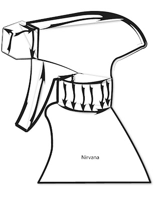
I felt that my drawing was a key aspect as it being the best out of all the work I did. So I scanned it and used it as my original picture and branched off of it with the different styles of brushes. Though I did try the other methods of free handing it on the computer it just ended up looking a little wonky and my drawings look more recognizable. I used just the bottle head because it gives me more detail to put in one place rather than a simple big object. But by still keeping the same look of a spray bottle worked out. All the different style of brushes came out looking great but the one that stood out the most was the graphical one. Just because the lines varied throughout it, it gave sense of direction and has great appealing visuals. It’s thick and jagged lines give expression of build up inside the bottle head. So I combined that with a shadow style illustration and it became my nirvana as it looks special and the best. The reason why I chose the graphical look to be my nirvana was due to all the expression and visuals it created with arrows. Thus making it more recognizable, in my opinion then the rest that were created. Overall that was my process of creating the object and then modifying it in illustrator.