Friday, January 20, 2012

CD Assignment


The Crooks
Lethal Menace Molson


The style I went for was an underground scene. My artist as I have stated is an underground rapper. This corresponds with my style and images. I used graffiti as them tagging their names as publicity. This is their form of communication and to mark their territory. The blue hue I used throughout was an underground perspective I came up with in the beginning of the design process. I wanted something to feel cool as if you are on the streets at night. My ideas were an outstanding process of work on Photoshop and illustrator. I used Photoshop first to create my ideas, in a bigger format than we needed as a rough draft. I then used illustrator with the templates I downloaded and resized my images to that size. Which I then printed it and created the full CD.

My ideas were original for this artwork. On the streets you will find graffiti, many of which are excellent pieces of art. I decided to go with the quick tag look and like a marker drip. This adds to his personality of being quick and to go with the flow. So the cover I took an image of a street wall, changed the color, brightness and contrast. Turning it into a cool bluish gray look. Put my Album Name and Artist Name in the graffiti font and made the opacity a bit lower so it looks like it’s dried up and that it isn’t just brand new. As well I added a parental advisory logo in the stone to show that he has explicit lyrics. Found one that was a spray paint stencil so it completely fit into my design, which was a plus.

Moving on to the next part which was the inside booklet. I incorporated the TTC map of the GTA and took out all the names. Its more of a subliminal message, now of graffiti locations. You can think of a lot of things for it, so it could be many messages in one. I as well added custom graffiti work in the background to create variety and visual contrast. It creates a sense of direction to since its arrows and question marks, basically stating “Where Next”. With a smoky overlay to cause a look of over spray of a clear coat. Used a blue color hue to create the look to flow together.

The back of the booklet was the simplest work made. I used a black background and used a paintbrush and used a splatter brush. Used a few versions and used different sizes of splatters to create a splatter feel that wasn’t too much. Added a hue to it and made everything blue to make it flow with everything that’s in the booklet.

For the inside tray card I took a tunnel and added lots of light streaks to cause movement for when the CD is placed in and out of the CD case. It’s a very eye popping and eye catchy part of the CD case. The blue really stands out due to the brightness of lights.

The last part would be the outside tray or the back. I ended up using another subway tunnel this time of it by the tracks. I took out the big sign on the wall and used the clone tool and slowly re created the wall. As you see it looks perfectly normal but you wouldn’t have known that if I didn’t tell you. I as well stretched it out so the front of the train in the tunnel disappears. I ended up using the same text style of a dripping marker. This added a good effect since it’s on a wall that curves. I distorted the text so the perspective would be that it is on the wall, as you see I did a very good job. I kept the text black so it stands out in the corner compared to the bluish cool gray background.

It came out better than I had expected at first. I didn’t know how I would’ve captured his image at first besides a street idea. When I came up with the process of graffiti I just let my mind take action and create a few ideas. Through this I found a way to incorporate the whole CD to flow together. By adding a hue to every picture of blue so the color, contrast all matched each other. As well to make sure it was a street style graffiti look. Overall a great looking underground CD I made that surprised me throughout the design process. 

Thursday, January 19, 2012

Random Album Cover Assignment


Random Album Cover Assignment


          The name of this band is Killer Pad and the title of the CD is “Drinks As Much As You”. The name itself corresponded with alcohol. The title flows with the name of the band, since its full of drinking, and the matter of how that can bring people out. The image itself is of alcohol, cocktails etc… It’s a very vibrant and glowing touch that defiantly is very pleasing to the eye and allows the text to mix perfectly with it. I chose a very neutral color to fade the text into the background but added some fine touches to make it stand out from the back. I chose a very modern font that I thought helped make it look more delicate and functway of mixing drinks. The cursive esk feel to it also represents a musical feel. The music is flowing throughout the atmosphere. A very good way to say that would be that the music is the drinks being poured into your glass. A very smooth techno style of music, to go along with a club pad. I don’t know how I got lucky that all three happened to correspond with each other. 

Tuesday, December 20, 2011

“Smoking Kills” Analysis


“Smoking Kills” Analysis

I felt that my idea to use skulls as the key aspect to perfectly flow with the idea that “Smoking Kills” as it is the best to show the dangers of smoking itself. My intent is to visually represent the future of constant use of smoking in a deeply depressing way. What I mean by that is to show the worst of the things that can happen to you such as death. So I took a picture of a skull of Google images and enhanced the features and added smoke to add an effect. I used three different skulls for three different posters. One was a 2D basic hazardous skull on chemical cans which I added a bright yellow and added an embossed to make it pop from the background. With a cross of cigarettes like the pirates use but not cross bones. The second one was a dark one which blended with a black background so I converted it to red with a color overlay and added optical flares into the eyes to make it extremely pop and catch your eyes, then added a cigarette to his mouth to resemble what I am conveying and then of course added more smoke which gave it a devilish look to it which helps me out by showing how its dangerous. The last one I used again was a skull but with just a plain grey with some smoke around it because I made t look like it came out of the cigarette when you blow the smoke. This caused an effect of realism towards smoking.

The reason why I chose the idea to talk about “Smoking Kills” is because a lot of people do it. My friends included. So I want to show people why you shouldn’t be doing this and many don’t know about the deadly facts about it, or they are to naïve to think about it. Within that my main quote used was “Tobacco kills about 45,000 Canadians a year. That's more than the total number of deaths from AIDS, car accidents, suicide, murder, fires and accidental poisonings combined.” Not only is it a very serious thought put forth into your mind which causes you to think about it more, but it hits you personally cause at first you would never of guessed the truth of that. So that’s why I decided to go with that quote and the pictures I had used. It all suited each other well and caused a great outcome for posters.

Monday, October 24, 2011

Typographic Self Portrait


Typographic Self Portrait Analysis

               With this project I used a picture from a few months ago where I had spiked hair. I began to trace the outline once I blew the image up. Then I came up with two slogans that represent me. Which were “Protect This House” and “I Will”, the reason behind these is simple to me. I am a defensive player in football and these motto's definitely represent that matter. I wanted to show myself as an athlete and a person who gives all his effort to task he is given. So I went ahead and started to type on the paths I created using that. The only bold features I used were for the inside of my ears, my eyes and my hair. The reason being is that, I used it to be an eye catcher so you get drawn into certain area of my face which would be the center. As well with the hair I made it bold, italic and a little fancier of a font so it would look like it’s spiked. I used two fonts, myriad pro and Century Schoolbook.  Myriad pro was used for the face to create a delicate, clean look while the Century Schoolbook was used for the hair to give more movement and a spike look to it. I didn’t use all the space, because I didn’t want to make it cluttered, I just wanted to have it resemble me. Overall this process was a little tricky to figure out how the text would lay out on the outline and form itself. But in my opinion it came out looking like me and I like the way the typography works out, it was a fun thing to do. It’s clean and dynamic and simple. Nothing to complex, but keeping the form of my original picture. 

Friday, October 21, 2011

Everyday Object Study


Everyday Object Analysis
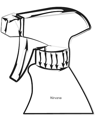
I felt that my drawing was a key aspect as it being the best out of all the work I did. So I scanned it and used it as my original picture and branched off of it with the different styles of brushes. Though I did try the other methods of free handing it on the computer it just ended up looking a little wonky and my drawings look more recognizable. I used just the bottle head because it gives me more detail to put in one place rather than a simple big object. But by still keeping the same look of a spray bottle worked out. All the different style of brushes came out looking great but the one that stood out the most was the graphical one. Just because the lines varied throughout it, it gave sense of direction and has great appealing visuals. It’s thick and jagged lines give expression of build up inside the bottle head. So I combined that with a shadow style illustration and it became my nirvana as it looks special and the best. The reason why I chose the graphical look to be my nirvana was due to all the expression and visuals it created with arrows. Thus making it more recognizable, in my opinion then the rest that were created. Overall that was my process of creating the object and then modifying it in illustrator.